Salubris
Health
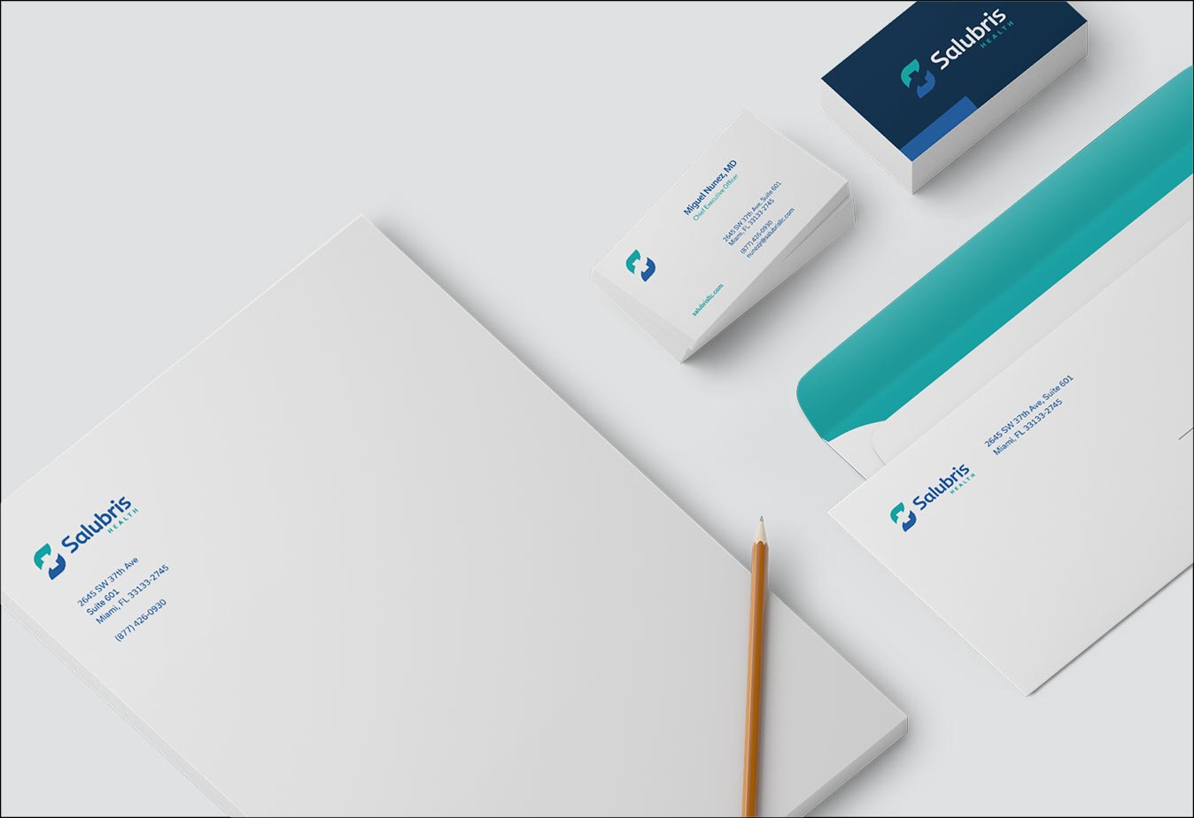
What we Did
- Rebrand
- Web Design
- Web Development

REDESIGNING
Healthcare
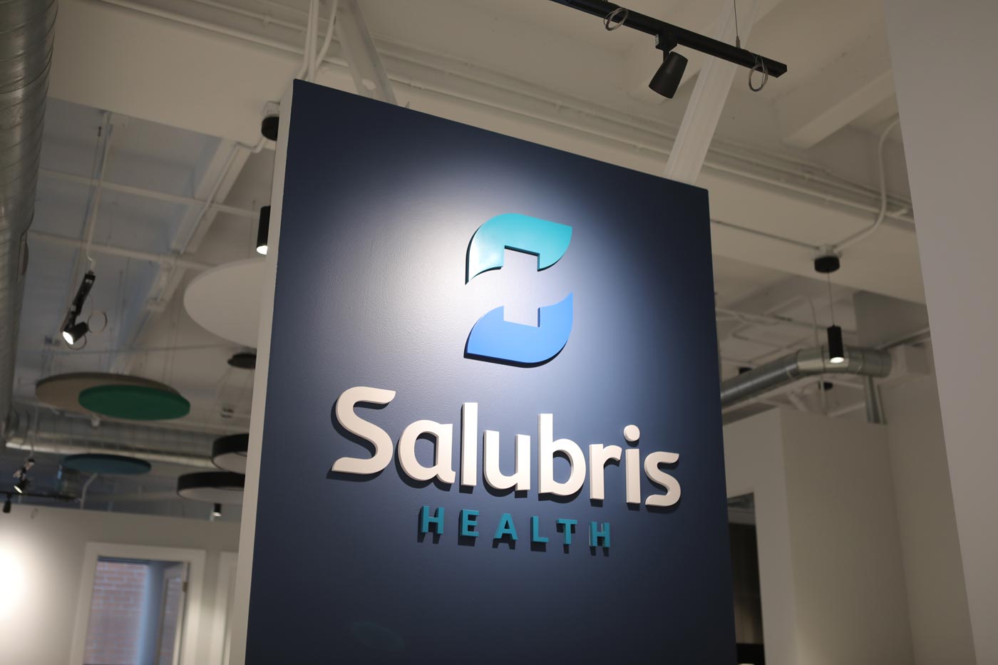
A modern healthcare management company that’s changing the way physicians operate–and the way healthcare companies speak with physicians. We purposefully reimagined the brand from the ground up, rooting its visual identity and voice in their unique, innovative approach by activating copy and symbolism that’s both familiar and unexpected.
![]()
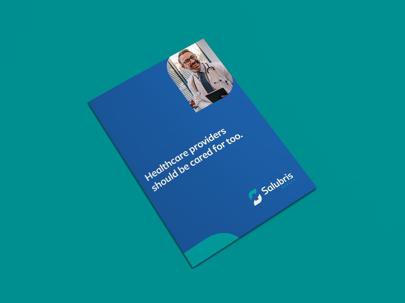
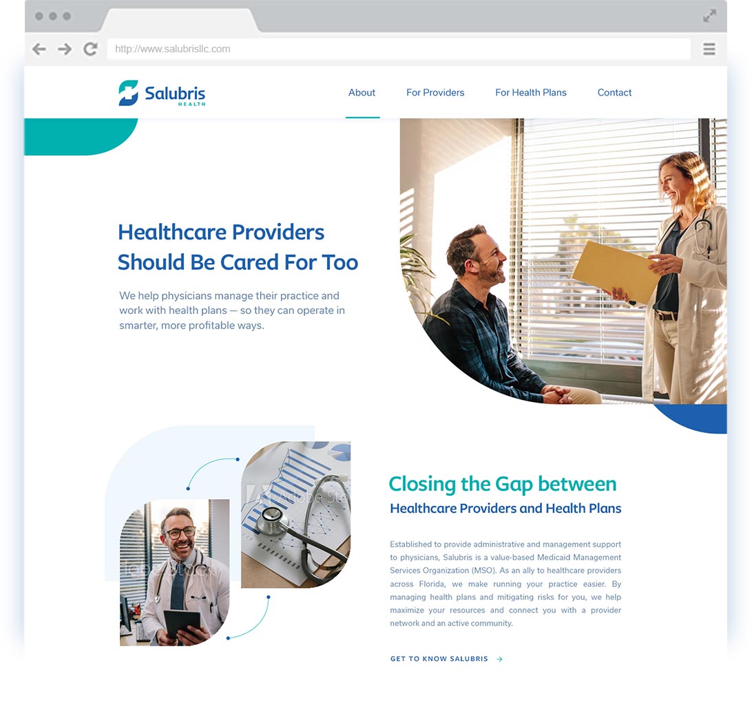
Serving dual
audiences
As a company that services both health care providers and health plans, Salubris has a dual audience. A large part of the brand strategy was to speak to everyone with candor and personality, approaching the uncomfortable subjects thoughtfully to disarm the challenges both audiences face. The website demonstrates this strategy and the value Salubris creates seamlessly within the new, approachable visual identity.
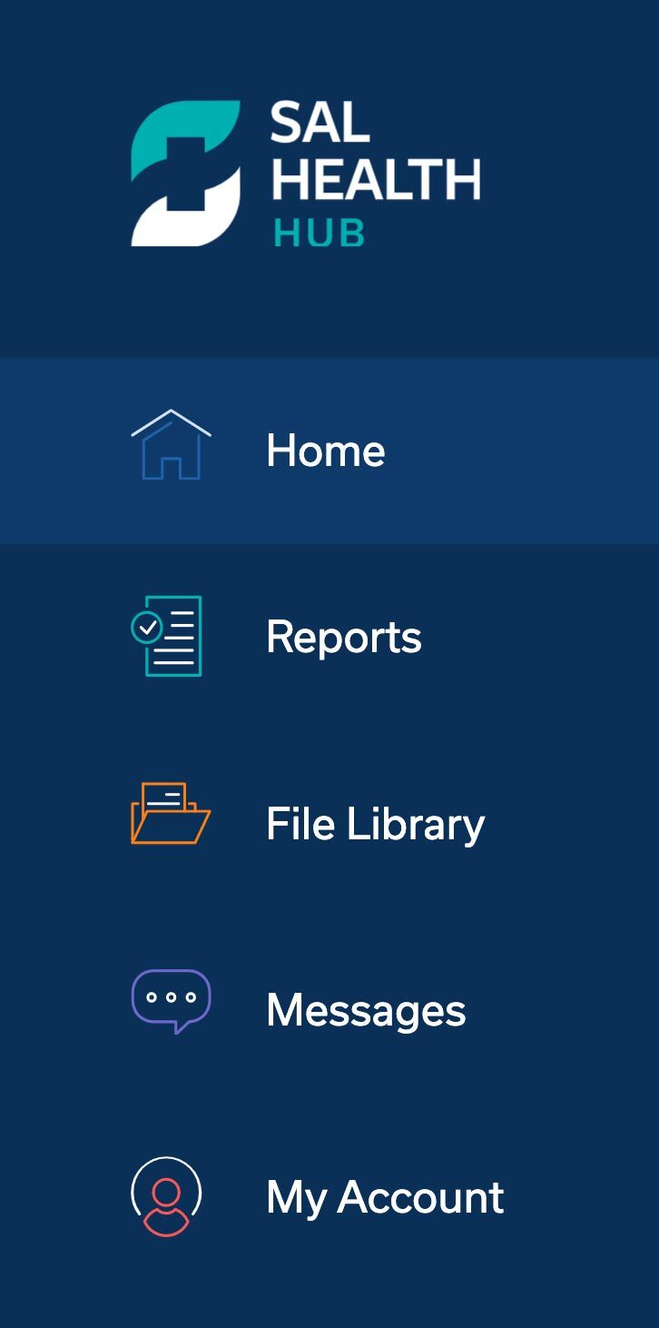
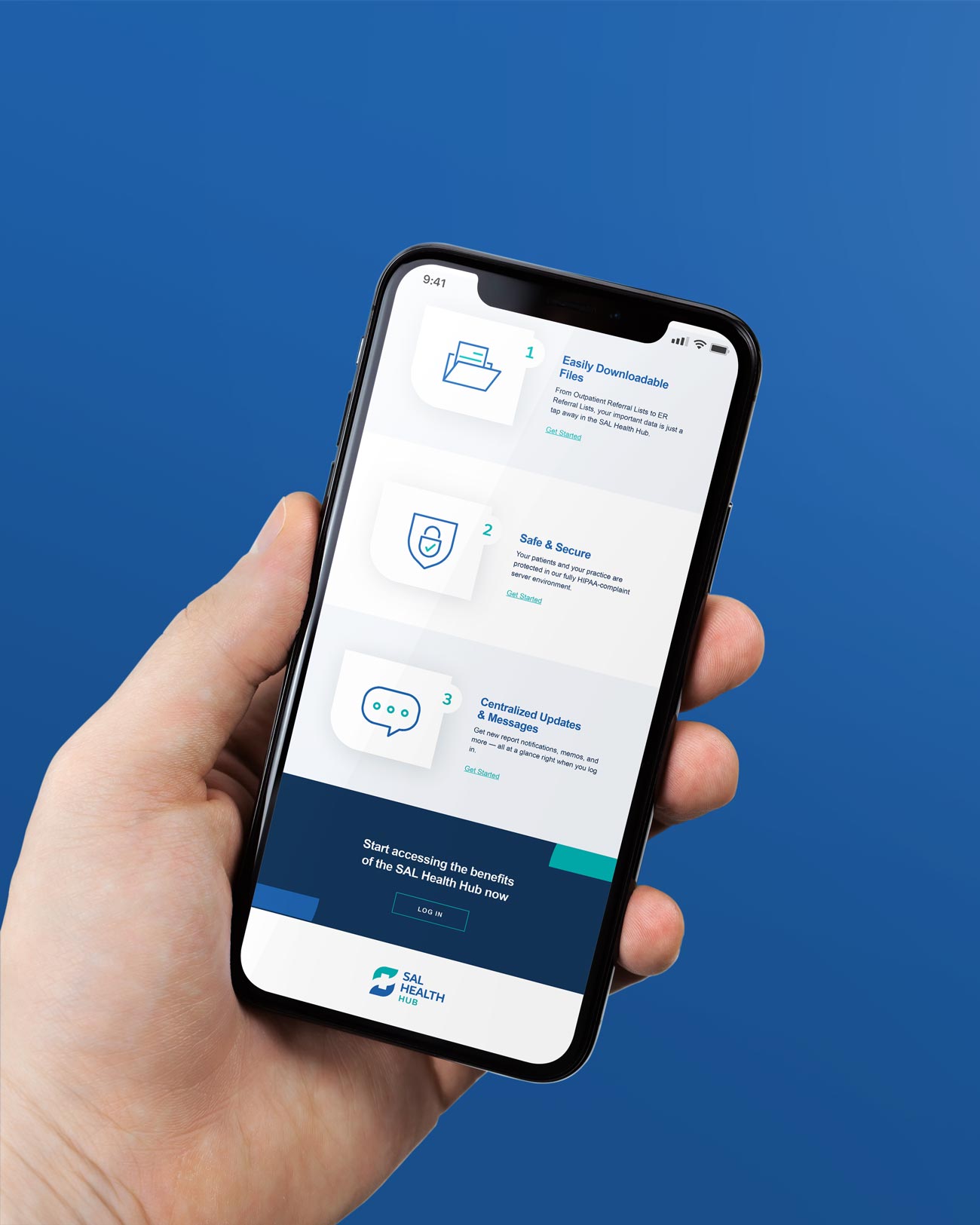
Improving
communication
One of the ways Salubris helps their costumers is by providing a wealth of business data. The downside to having lots of data is that it can become cumbersome to navigate. By designing for the user, we developed a robust web portal that anyone could easily find their way around from the moment they logged in. As a result, customers now have an easier way to find what they need, and Salubris can communicate with more ease.